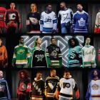
The NHL has released its latest round of Reverse Retro jerseys, and that means it is time to overreact online. To be fair, more teams than usual hit it out of the park with these uniforms, but there are still some stinkers out there.
As we all know, nostalgia is a very powerful agent, and the common thread for the big winners on this round of Reverse Retro jerseys was that they all played the hits. Now is not the time for deep cuts or trying to reinvent the wheel.
The teams that failed in this latest exercise tried to do too much - or seemingly didn't do much at all. Still, those were somewhat few and far between.
The Good
Florida Panthers
Perfection ☀️🌴🏒
— Florida Panthers (@FlaPanthers) October 20, 2022
Preorder online today! Also available at Pantherland 11.15.#TimeToHunt x @adidashockey pic.twitter.com/ffpDb1F921
The Panthers are one of few teams that have crushed both versions of the Reverse Retro jerseys. Using baby blue as the primary color was an excellent idea, and the palm tree-hockey stick combo was an underrated secondary logo for years. Once the Panthers take the ice in these, it will be underrated no more.
Vancouver Canucks
Throwback to 1962.
— Vancouver Canucks (@Canucks) October 20, 2022
Introducing our @adidas Reverse Retro 2022 #ReverseRetro
Available 11.15 - pre-order on https://t.co/LrfISlAneT#Canucks x @adidashockey pic.twitter.com/qjXXnE8cMN
I'm a sucker for a hockey logo wherein the mascot is actually playing hockey. The Canucks delivered on that front and gave me a fantastic color scheme. The number on the front of the jersey may bother some, but not me. All I see is a cool lumberjack playing some puck.
Edmonton Oilers
Introducing our @adidas #ReverseRetro 2022.
— Edmonton Oilers (@EdmontonOilers) October 20, 2022
Available 11.15#LetsGoOilers x @adidashockey pic.twitter.com/x0SS0TGYld
The Oilers have a classic logo, but I have a soft spot for the frozen oil drop. I think it's fun, and Edmonton was able to give it a bit of an update by throwing some orange in there. This was an easy win, and the Oilers didn't mess this up.
Colorado Avalanche
Our love of home, and love of hockey. #ReverseRetro
— Colorado Avalanche (@Avalanche) October 20, 2022
Preorder today, jerseys ship November 15. #GoAvsGo x @adidashockey pic.twitter.com/FwRR32YxRc
The Avs are another team with two great Reverse Retro looks. They do have a lot of good material to work with between the Quebec Nordiques and the Colorado state flag. Having said that, the Avalanche have still executed well, and I think this jersey will look great when they're dropping six goals on their opponent.
Pittsburgh Penguins
Reverse Retro Schedule:
— Pittsburgh Penguins (@penguins) October 20, 2022
• November 15 vs. TOR
• November 25 at PHI
• November 29 vs. CAR
• December 6 vs. CBJ
• December 20 vs. NYR
• January 10 vs. VAN
• January 25 vs. FLA pic.twitter.com/rxujgqwCs5
I prefer the Penguins' current logo (see: Vancouver Canucks), but the realistic penguin isn't bad by any means. Besides, any logo worn by Jaromir Jagr and Mario Lemieux will bring back a flood of nostalgia. Beyond the logo, this is just a sharp jersey.
Los Angeles Kings
ROYALTY 👑#reverseretro
— LA Kings (@LAKings) October 20, 2022
Get yours 11/15#GoKingsGo x @adidashockey pic.twitter.com/q64xzC0ud3
The Kings have some of the worst regular jerseys in the NHL, but their stable of alternates stacks up with any other team's. They added to that with the newest Reverse Retro look. The crown is a good logo, but the purple and yellow color scheme takes it to another level. Just make these the permanent road uniforms.
New Jersey Devils
In '82 the Rockies relocated to Jersey and became the #NJDevils.
— New Jersey Devils (@NJDevils) October 20, 2022
Our 2022 @adidashockey #ReverseRetro uniform pays homage to that history.
📰: https://t.co/Z2miy7I9di pic.twitter.com/A6hXgior73
These don't get me into the holiday spirit quite like the Devils' first Reverse Retro jersey, but this one also stands out as one of the best. New Jersey has an iconic logo, so no need to change anything up there, and the Rockies colors work for me. If the Reverse Retro series has taught us anything, it's when in doubt, turn to the team you stole from another city.
Winnipeg Jets
Whiteout /// Rebooted#reverseretro Get yours 11.15#GoJetsGo x @adidashockey pic.twitter.com/2gjc86LRIW
— Winnipeg Jets (@NHLJets) October 20, 2022
The Jets can go back to this well every time they make a new alternate jersey, and I'm going to love it every time. The throwback logo with the current colors gives Winnipeg an icy look, and it will be especially striking during whiteouts at the Canada Life Centre.
Buffalo Sabres
The #ReverseRetro jersey will be available November 15!#LetsGoBuffalo x @adidashockey pic.twitter.com/vZFJOdfvHK
— Buffalo Sabres (@BuffaloSabres) October 20, 2022
The buffalo head is not quite as intimidating without the red and black color scheme, but the Sabres actually embraced the spirit of the Reverse Retro concept. They brought back an old look with a bit of a modern twist. They get points for that, and the buffalo head remains one of my favorite ridiculous logos in all of sports.
Boston Bruins
(Pooh) Bear necessities. #reverseretro
— Boston Bruins (@NHLBruins) October 20, 2022
Get yours 11.15#NHLBruins x @adidashockey pic.twitter.com/stgQ4QyUUp
The Pooh Bear logo is one of the most polarizing in the NHL, and frankly, it does look pretty bad on its own. However, the entire thing comes together in such absurd fashion that it just works. Besides, if a team simply recreates a jersey that was popular when I was young, they've got me on the hook. If you were sensing a theme throughout these rankings, that's it.
St. Louis Blues
1966 meets 2022 💛
— St. Louis Blues (@StLouisBlues) October 20, 2022
Get your #ReverseRetro 11.15 or order presale today at 11 a.m.#stlblues x @adidashockey pic.twitter.com/2sL4is8coM
I can't help but like everything the Blues do with their uniforms. Their color scheme is one of the NHL's elite, and their throwback looks always seem to land. This jersey does the trick, and I like using yellow as the primary color to change things up a bit.
Montreal Canadiens
𝗕𝗼𝗻𝘀𝗼𝗶𝗿, 𝗶𝗹 𝗲𝘀𝘁 𝘀𝗼𝗿𝘁𝗶!
— Canadiens Montréal (@CanadiensMTL) October 20, 2022
Voici @adidas #ReverseRetro 2022
Disponible le 15 nov.
𝗧𝗵𝗲 𝗕𝗼𝘆𝘀 𝗼𝗳 𝗪𝗶𝗻𝘁𝗲𝗿
Introducing our @adidas #ReverseRetro 2022
Available 11.15#GoHabsGo x @adidashockey pic.twitter.com/rYvUQSGDNO
This is really just the Canadiens usual jersey in different colors, but two things make that acceptable in my eyes. For starters, these are Montreal Expos colors, which makes this very cool. Secondly, the powder blue looks fantastic. Montreal went simple, and it paid off.
Washington Capitals
𝗘𝗘𝗘𝗘𝗘𝗘𝗘𝗘𝗔𝗚𝗟𝗘
— Washington Capitals (@Capitals) October 20, 2022
Get your #ReverseRetro 11.15#ALLCAPS x @adidashockey pic.twitter.com/0GOyOPtPAj
In the sake of full disclosure, I am a hypocrite. Later in these rankings, I will criticize other teams for taking its last Reverse Retro jersey and just changing the colors. The Capitals did it here, but this jersey is gorgeous, and that outweighs their laziness.
New York Rangers
Iconic. Perfection. 😍
— New York Rangers (@NYRangers) October 20, 2022
Available for preorder at 12 PM today on https://t.co/wT6lc1Qyxb or at the MSG Team Store on Nov. 15. #NYR x @adidashockey. https://t.co/GyKRmyJvtU pic.twitter.com/nVlqCrqAo2
The Lady Liberty jerseys are some of my favorite alternates in NHL history. The Rangers went that route on their first Reverse Retro jersey, but they kind of messed it up by going with dark navy all over, except for three stripes on the arm. This time, they brightened up the blue and used more red in the sleeves, and they hit a home run.
New York Islanders
The next era of the Fisherman is here.
— New York Islanders (@NYIslanders) October 20, 2022
Introducing our @Adidas #ReverseRetro 2022
Available 11.15 | #Isles x @adidashockey
Preorder yours starting at 12PM on https://t.co/3e5gLhpyyQ pic.twitter.com/4kH0q7H212
I do not need to look beyond the logo to know that I love these Islanders jerseys. The people wanted fish sticks. They gave us fish sticks. After completely botching their first Reverse Retro uniform, the Isles have absolutely redeemed themselves.
Nashville Predators
Throwing it back to 2001 ⏪
— Nashville Predators (@PredsNHL) October 20, 2022
Get your #ReverseRetro 11.15#Preds x @adidashockey pic.twitter.com/HXmiIj9gMg
Allow me to take off my objective journalist hat and set it to the side for this one. The mustard cat was widely panned when it made its debut in 2001, and I defended it until the day it was retired and beyond. This jersey has become a cult classic in Nashville, and now a new generation will fall in love with the high fashion that is the mustard cat.
Calgary Flames
Back in black 🔥 #ReverseRetro
— Calgary Flames (@NHLFlames) October 20, 2022
Get yours 11.15#Flames | @adidashockey pic.twitter.com/UUhHwYbTjJ
This is catching some hate online, and I don't exactly see why. Sure, I was hoping for a white Blasty jersey with the throwback colors, but I kind of like this look as well. Also, it gives me Zebra Stripe vibes, and that is a quality gum.
The Bad
Toronto Maple Leafs
2022 ⏪ 1962#reverseretro Get yours 11.15#LeafsForever x @adidashockey pic.twitter.com/sxoQZx5ObI
— Toronto Maple Leafs (@MapleLeafs) October 20, 2022
This jersey looks fantastic. It's gorgeous. It might be my favorite that Toronto has released in a while. Having said that, there is not much Reverse Retro about this. It feels like the Maple Leafs skirted the assignment here, so I have to take points off for not taking a bigger swing.
Anaheim Ducks
Our Mighty past meets the future#reverseretro Get yours 11.15 #FlyTogether x @adidashockey
— Anaheim Ducks (@AnaheimDucks) October 20, 2022
MORE INFO: https://t.co/w8jH9QXJWt pic.twitter.com/J4Yp4RhOE5
Speaking of teams with good jerseys that are being punished, the Ducks have given us a white Mighty Ducks jersey with their current disgusting color scheme. They already have one of these in orange, and while I do like this one more, Anaheim is in timeout until it fully embraces its Mighty roots.
San Jose Sharks
You already know 🦭🦈
— San Jose Sharks (@SanJoseSharks) October 20, 2022
Here’s a closer look…
get yours 11.15.#ReverseRetro x #SJSharks x @adidashockey pic.twitter.com/kq8OGV4qAr
When I heard the Sharks were going to go with a California Golden Seals theme, I got very excited. Then they debuted these, and I was a little underwhelmed. I wanted to love these, but I just can't for some reason. Maybe it's the stripes into the armpits.
Vegas Golden Knights
We’ve joined the diagonal club 😜
— Vegas Golden Knights (@GoldenKnights) October 20, 2022
Get yours 11.15 🤩
⁰#VegasBorn x @adidashockey pic.twitter.com/mDERZBcxR9
These are far from the worst jerseys that were unveiled today, but I think diagonal letters jumped the shark with C-A-N-E-S (more on that later). From now on, the Rangers and Penguins are the only teams that can do diagonal letters. Vegas has a decent alternate logo. Just slap that in the middle of the jersey.
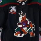
Arizona Coyotes
Bringing the heat. 🔥
— Arizona Coyotes (@ArizonaCoyotes) October 20, 2022
Get yours 11.15#Yotes x @adidashockey pic.twitter.com/o2IpCe2CQC
I like that the Coyotes have gone back to their kachina jerseys, and I really liked their last Reverse Retro look. However, they just took that one and made it worse. The lack of purple in favor of a more realistic desert look is what sinks this jersey in my eyes.
Dallas Stars
1993 meets 2022.#reverseretro
— Dallas Stars (@DallasStars) October 20, 2022
Get yours 11.15#DallasStars x @adidashockey pic.twitter.com/eR7n2fLdCT
This is an upgrade over the Stars' last Reverse Retro jerseys, but it still falls somewhere in the bottom half of the league. I like the old logo, but it was lacking something, and at first I couldn't put my finger on it. Then I realized Dallas committed a major blunder by not making the striping and border of the jersey into the shape of a star, as it did in the past.
Carolina Hurricanes
2019 ➡️ 2022 😅 #ReverseRetro
— Carolina Hurricanes (@Canes) October 20, 2022
Get yours 11.15#LetsGoCanes x @adidashockey pic.twitter.com/pgwJXJ0vBG
Essentially, the Canes already took their bad road jersey and made it a home jersey. Carolina followed the formula of harkening back to the team you stole last time, and it worked. The Hurricanes decided to blaze their own trail this time, and it led them off a cliff.
Minnesota Wild
Clean in green. #ReverseRetro
— Minnesota Wild (@mnwild) October 20, 2022
Get yours 11/16 | #mnwild x @adidashockey pic.twitter.com/9fy5YeurQd
Did you love the Wild's original Reverse Retro jersey? Do you want the exact same thing in green? We have the jersey for you.
Ottawa Senators
#reverseretro
— Ottawa Senators (@Senators) October 20, 2022
Commande le tien 11.15#GoSensGo x @adidashockey pic.twitter.com/LTHUJtmCDk
The Senators have already made the switch back to this logo full-time, and they have a black home jersey. Ottawa simply added worse numbers and obnoxious striping.
Philadelphia Flyers
⚪️🟠⚫️#ReverseRetro
— Philadelphia Flyers (@NHLFlyers) October 20, 2022
Get yours 11.15.#FueledByPhilly x @adidashockey pic.twitter.com/yeJXE1VeAW
Every year, it seems like a team forgot they had to turn in a new jersey and just threw something together at the last minute. This time, it was the Flyers. This just seems like a basic road jersey, but I have to give them credit for adding Cooperalls to the ensemble for warmups.
The Ugly
Tampa Bay Lightning
Vibe check. What do y'all think? 👀
— Tampa Bay Lightning (@TBLightning) October 20, 2022
Get yours mid-November. #GoBolts x @adidashockey pic.twitter.com/Uph7c8P3Vr
The Lightning went for it with the old storm uniform. I appreciate them going bold and swinging for the fences. That's more than I can say for other teams on this list. However, this is a bad jersey. It has always reminded me of a roller hockey uniform, and nothing will ever change that.
Columbus Blue Jackets
The old with the new. Remixed for 2022.#reverseretro
— Columbus Blue Jackets (@BlueJacketsNHL) October 20, 2022
Get yours 11.15#CBJ x @adidashockey pic.twitter.com/bUOKkkkDzO
Talk about a team in need of a rebrand. I feel for Adidas here because the Blue Jackets have a bottom-tier NHL logo. Columbus already has an incredibly mediocre home jersey, and this didn't elevate it at all.
Seattle Kraken
🔄🦑
— Seattle Kraken (@SeattleKraken) October 20, 2022
Pre-order your #reverseretro online today starting at 9am PT. Available in store on 11.15#SeaKraken x @adidashockey pic.twitter.com/KTxpfhCstq
The Kraken have all of 87 games of history, so they didn't have much to work with on this one. The team did call back to the Seattle Ironmen with the two-tone look, but give me something more. Use the alternate logo. Give me a full kraken. On the bright side, the Kraken have some of the best uniforms in the league already. Keep wearing those.
Chicago Blackhawks
𝙍𝙚𝙫𝙚𝙧𝙨𝙚 𝙍𝙚𝙩𝙧𝙤 🔥
— Blackhawks Store (@BlackhawksStore) October 20, 2022
Pre-order at https://t.co/z00JjWzbba 🛍 pic.twitter.com/6YpLsvSnqA
Where are the Blackhawks from? Oh, yeah...
Detroit Red Wings
🤩 #reverseretro⁰⁰Get yours 11.15⁰⁰#LGRW x @adidashockey pic.twitter.com/87kRDN3c2l
— Detroit Red Wings (@DetroitRedWings) October 20, 2022
Where are the Red Wings from? Oh, yeah...