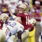
College football has a lot more flexibility in terms of uniforms than the NFL does. Teams can more or less wear what they want when they want. With that in mind, college football creative teams are always looking to put something together that will "wow" and make headlines. While some designs get extremely busy, sometimes you find the sweet spot between fresh and clean.
Whether it's a throwback or a pure alternate, however, there are a lot of ways to make a jersey look good. Sometimes, you totally botch it -- like the Yankee knockoffs Notre Dame is wearing in November -- but sometimes, you get it just right.
If you're wondering, the criteria to get on the list is simple: It has to be a legitimate alternate/throwback (that means no blackouts and no whiteouts. Alternate helmets are also excluded, as are unusual color combinations) that was rolled out this year (which is why Pittsburgh isn't on this list).
So, without further ado, here are the top 10 alternate jerseys we've seen so far this year.
10. Louisville "Hard Knox" alternates
Worth our weight in gold.
— LouisvilleFootball (@UofLFootball) October 8, 2018
Check out our new Hard Knox unis fitted by @adidasfballus.#A1 #L1C4 #teamadidas
Since ditching the much-maligned tire tread design, Adidas has done some good work. The gold outline on the numbers is a cool aesthetic, as are the gold flecks. In fact, that much of a metallic number ends up complementing the chrome helmet really well. The only drawback here is the weird white accent on the shoulder. It looks like it's meant to look fluid, but it just ends up looking weird.
9. Colorado State Ag Day
Ag Day is Saturday, and you already know what colors we will have on.
— Colorado State Football (@CSUFootball) September 19, 2018
(Open for the full look)#EDGE #CSURams pic.twitter.com/SAdmzFJFib
This is the first of a few times we'll see teams using homecoming week to hearken back to other eras. The Colorado State Rams celebrated "Ag Day" with a tribute to their Aggie roots. The orange color of the jersey ends up looking nice in an era where there just aren't enough loud color palettes, and the orange ram horn ends up being a really effective hybrid of past and present mascots.
8. California "Joe Roth Era"
Saturday, we honor a legend.
— Cal Football (@CalFootball) October 9, 2018
Joe Roth. pic.twitter.com/2f69wHgSTw
Cal kind of has a Chargers situation on its hands. Where the Chargers switched from powder blue threads to navy ones, California went to navy from a babyish blue. Joe Roth, who died in 1977 at 21 years old from melanoma just three months after college football's regular season ended, is a name indelibly tied to California football. These jerseys are a great way to honor that connection.
7. North Texas "Mean Joe Greene"
He’s the 🐐 and the only Mean Green Football player to wear the No. 75 in the last 50 years. Until this week. For one day only, the iconic Joe Greene jersey is coming out of retirement. #GMG #UniSwag pic.twitter.com/jeaqesZ5n2
— North Texas Football (@MeanGreenFB) September 26, 2018
What's cooler than breaking out a throwback jersey? Breaking out a retired number, of course. No one at North Texas had worn No. 75 since Mean Joe Greene 50 years ago, until La'Darius Hamilton on Sep. 29. The reveal here gets some bonus points, because unveiling those smooth, simplistic jerseys with a reference to Greene's famous Coke commercial is just about the coolest way to unveil jerseys ever.
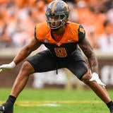
6. Oregon State "Angry Benny"
You didn't think we were stopping at just a helmet, did you?
— Go Beavs (@BeaverAthletics) October 8, 2018
Gear up: https://t.co/iljsR1jIQL pic.twitter.com/mbBL4Y0UDH
More teams should embrace the angry mascot with a sailor hat logo. Thank you for coming to my TED Talk.
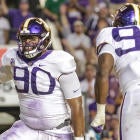
5. Georgia Tech 1990 throwback
.@adidasFballUS drew inspiration from our 1990 National Champions for our alternate jerseys this Saturday 🔥🔥🔥#ThreeStripeLife #teamadidashttps://t.co/cFy2OQHRlq pic.twitter.com/VJ60Z38Aj6
— Georgia Tech Football (@GeorgiaTechFB) September 17, 2018
Muted navy and gold is just the sickest color combination. These jerseys are insanely clean. The only gripe I have with these is that I wish the gold collar went all the way around (it feels like every jersey manufacturer struggles with collars for some reason), but these jerseys are so nice looking with their muted tones that it doesn't even end up looking that bad.
4. Shepherd "Ghosts of Shepherdstown"
Ghosts of Shepherdstown unis for the Rams this weekend pic.twitter.com/036kypJTiw
— Calvin Reighard (@GOreigHARD) September 24, 2018
If you're one of the most haunted towns in America, then you'd better live up to the billing. Shepherd paid tribute to its haunted past by fielding ghost uniforms this year, and they looked awesome. While gray jerseys often end up looking boring, these pair unbelievably well with the navy blue shoulder stripe. The history behind these jerseys only makes them cooler.
3. Oklahoma State "Barry Sanders Era"
Respect the 🐐.
— Cowboy Football (@CowboyFB) October 22, 2018
📸 https://t.co/yEBdNF1M5d #okstate #GoPokes pic.twitter.com/8spaeNf4TZ
These look even better with Oklahoma State's wild 38-35 win over then-No. 6 Texas. The Barry Sanders-era Oklahoma State throwbacks are beautiful. 30 years ago, Sanders had arguably the craziest season in CFB history. In 1988, he rushed for 2,628 yards and and 37 touchdowns. Unfair. For that alone, these jerseys deserve to be revisited. They're loud, but they're not in your face. The letters on the helmets look great. The shoulder stripes are throwback-chic. You just can't beat the classics, as this year has consistently reaffirmed.
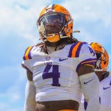
2. LSU "Silent Season"
Uniforms designed for the future that pay respect to the past. #LSU125 pic.twitter.com/qmOmdRPlAF
— LSU Football (@LSUfootball) October 18, 2018
Speaking of history, these jerseys are absolutely outstanding. LSU paid tribute to 1918's Silent Season -- the one year in which LSU didn't play football -- with these outstanding jerseys. The oak pattern in the numbers blends well, the nameless jerseys to honor unknown soldiers that died in World War I and the piece de resistance: A purple helmet that shifted to gold under the lights in Death Valley. These jerseys were immediately acclaimed, and it's easy to see why.
1. Tulane "Friday Night Lights"
💡 ⚫ Friday Night Lights ⚫ 💡 #UniReveal for tomorrow's game vs. @MemphisFB, courtesy of @TulaneEquipment. #RollWave @uniswag pic.twitter.com/XlBUF6Ya3q
— Tulane Football (@GreenWaveFB) September 27, 2018
Which brings us to the single best logo in college football: Tulane's angry wave. The Green Wave released these jerseys to universal acclaim in September with the main draw being the enlarged angry wave logo that takes up most of the helmet (with a lot of focus on its face). It's a great way to take the weird trend of enlarging logos and make it look awesome. Tulane was lauded for this look, and it's well-deserved. Anything that brings that mascot into focus deserves praise.
Every week, we'll be updating this list with the best jerseys through that week. So make sure to check back and see which upcoming alternate uniforms end up making the list.