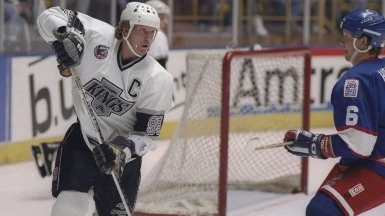
Out with the old, in with the (somewhat) new? That's the approach the Los Angeles Kings have taken as they revealed their new logo Thursday. It was inspired by the 1990s and hockey legend Wayne Gretzky's time with the franchise, which lasted from 1988 to 1996.
As part of the Kings' rebranding, the team brought back the "Chevron" logo, enlarged the phrase "Los Angeles" at the top, and updated the original 1967 crown underneath the "Kings" font. It had previously appeared on the team's 90's Era Heritage jerseys, which were worn for the past few seasons.
#NewProfilePic pic.twitter.com/xdNvoAdTUC
— LA Kings (@LAKings) June 20, 2024
The newest design ushers their now-former logo—which first appeared on an alternate jersey in 2008—into retirement. According to a press release by the Kings and the NHL, this redesign was two years in the making.
"This has been an extensive and collaborative process, and we are thrilled to roll this out to our fans and the city of Los Angeles," Kings president Luc Robitaille said. "This evolution is rooted in our 57-year history and embraces the elements of our eras. It also involved interface and feedback with players both past and present, and it sets the stage for extensions and new iterations in the future."
Kings chief operating officer Kelly Cheeseman added that the team's updated design "represents the very best of the LA Kings."
"From ownership to our players, our organization is proud to usher in a new era of LA Kings Hockey. We are excited for our fans to be part of this with us," he added.
The Kings' new designs will be available for purchase at Crypto.com Arena's Team LA Store beginning Friday, June 21.